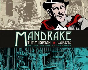
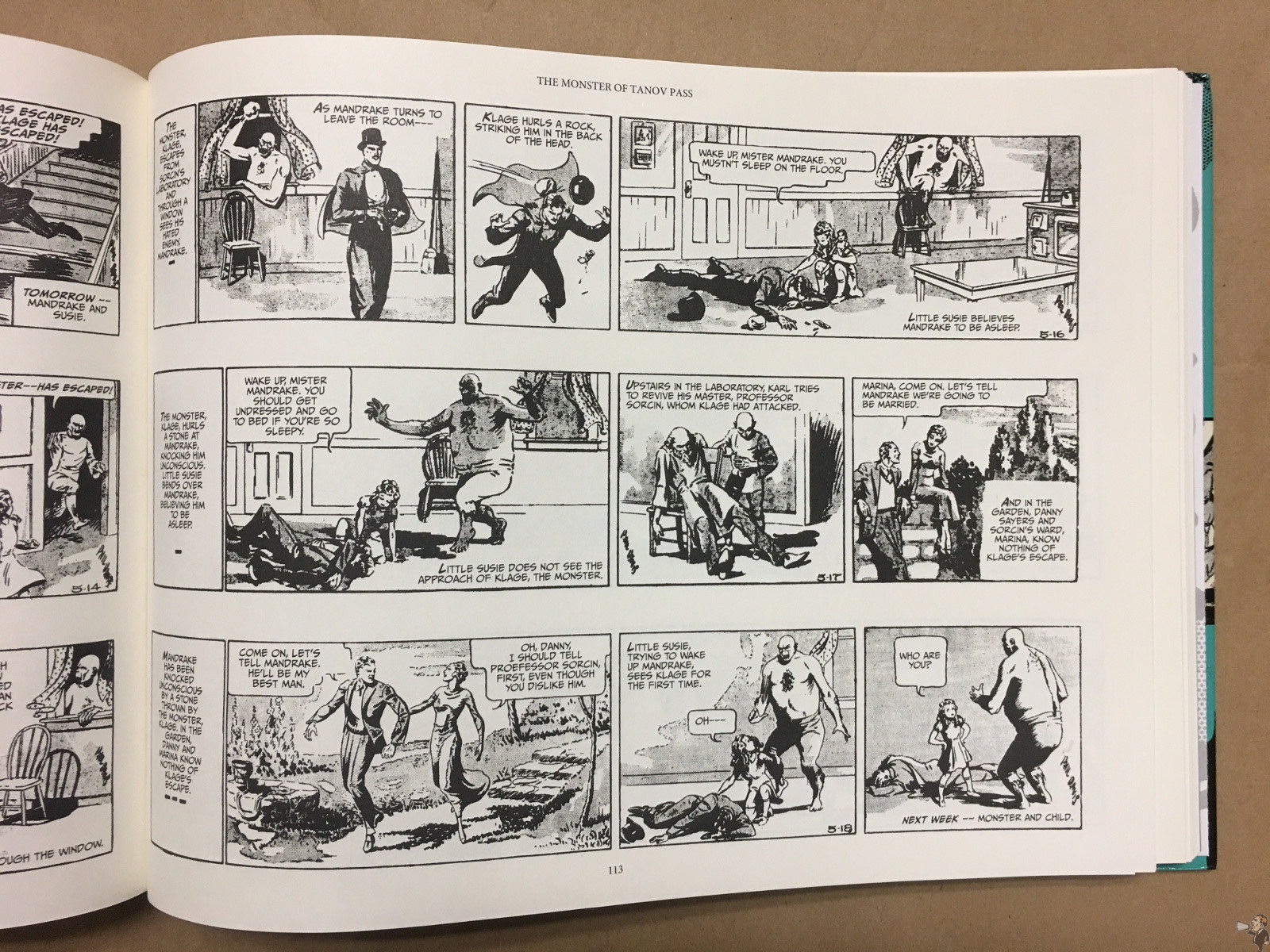
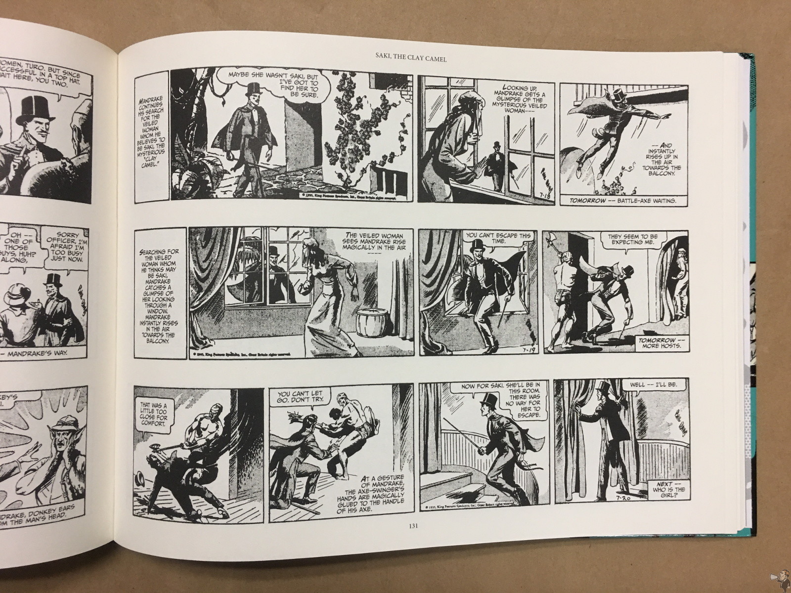
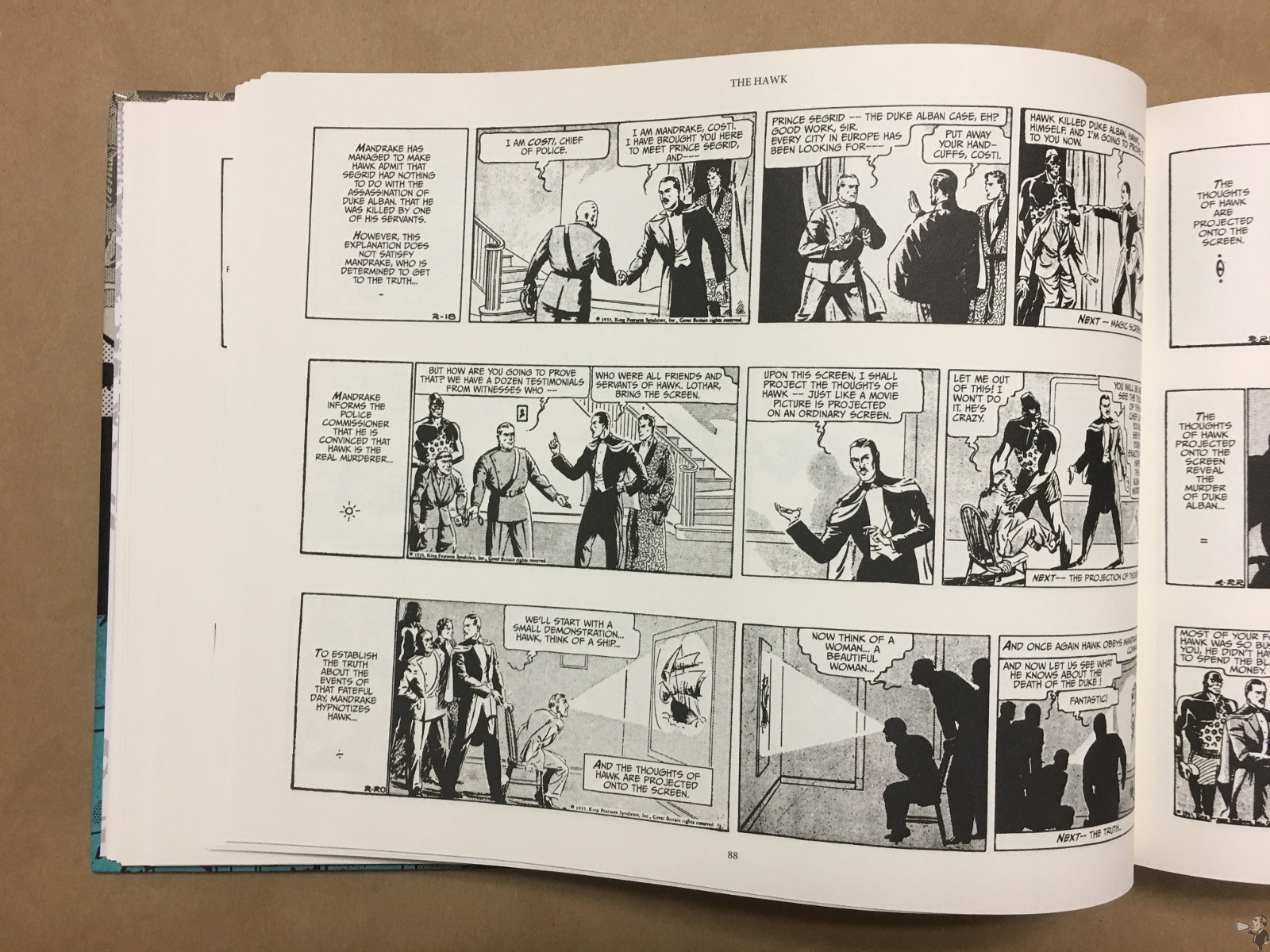
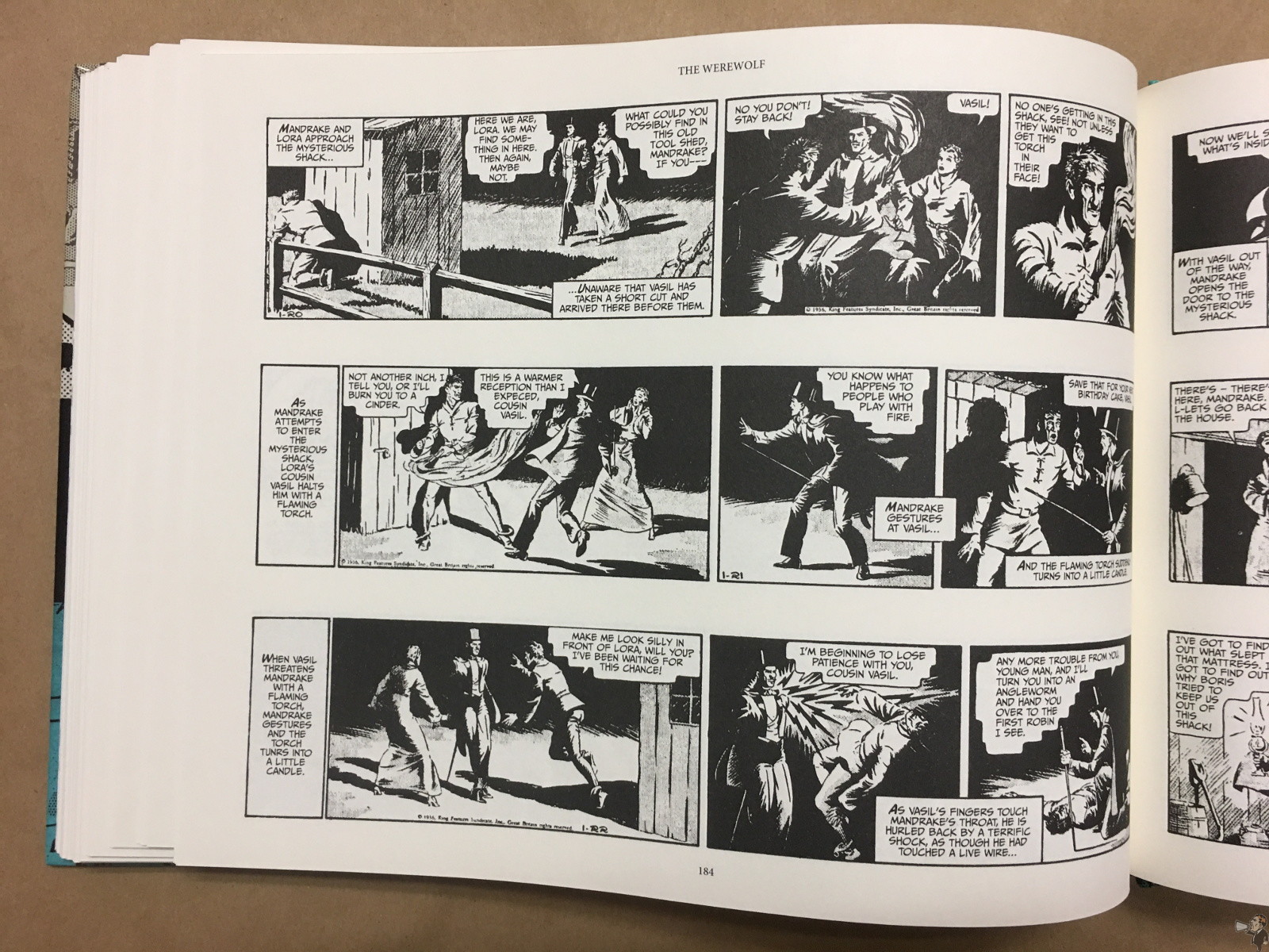
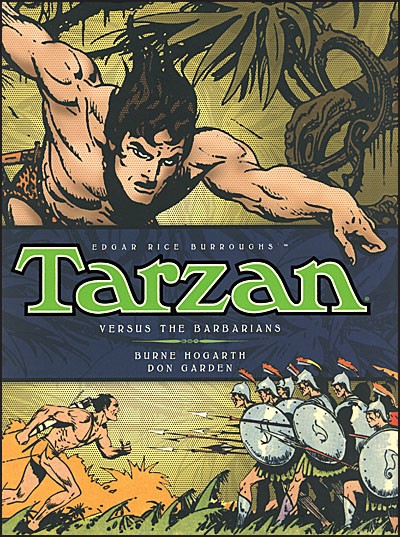
From the depths of the moon to the heights of the terrifying Ghost Mountain, these are the second collected adventures of Mandrake the Magician, the world’s first costumed crime fighter. Join him and his ever-trusty companion Lothar as they travel the world in search of excitement and adventure.
- Lee Falk, Phil Davis
- Titan Comics, December 2016
- Hardcover, 240 pages, 11.5″ x 9 “
- ISBN: 9781782766902
- $39.99 USD
- Order online: Amazon
Like most comic strips of its time, Mandrake emerged fully formed and without origin or explanation. A magician with incredible powers, travelling the world and righting wrongs. Aided by his inhumanly strong sidekick Lothar, Mandrake is simply ridiculous, but in a wonderful way.
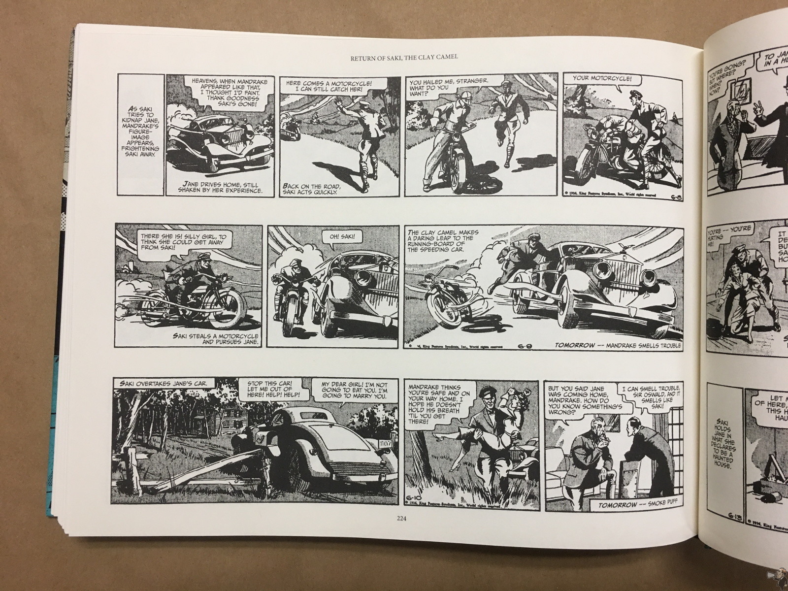
The second Mandrake strip collection from Titan; for some reason they led with a colour Sundays collection. This strip delivers on what the readers would have wanted in this early adventure strip: exotic locations, damsels in distress, and dastardly villains. Mandrake is the straight man throughout.
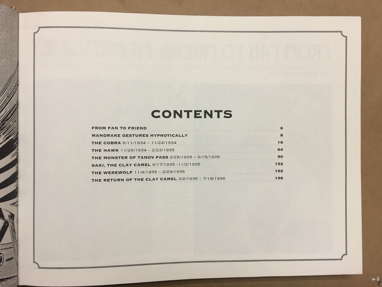
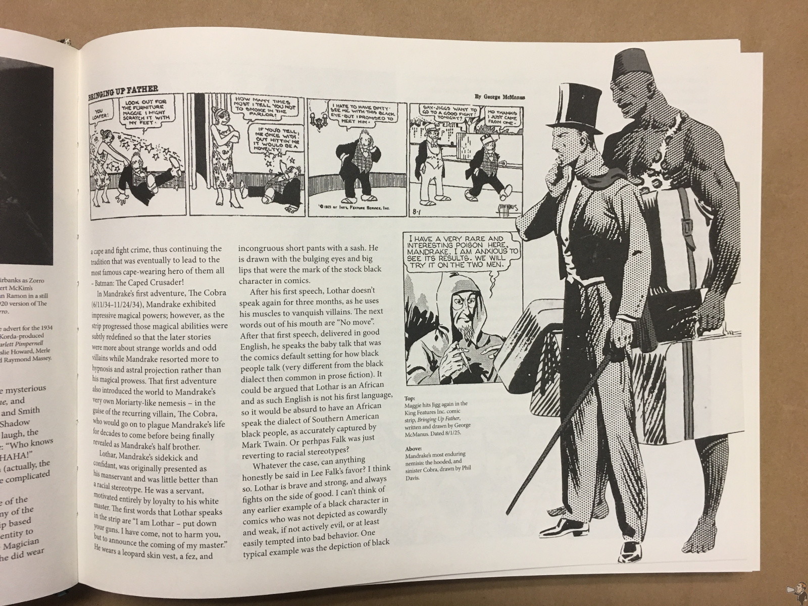
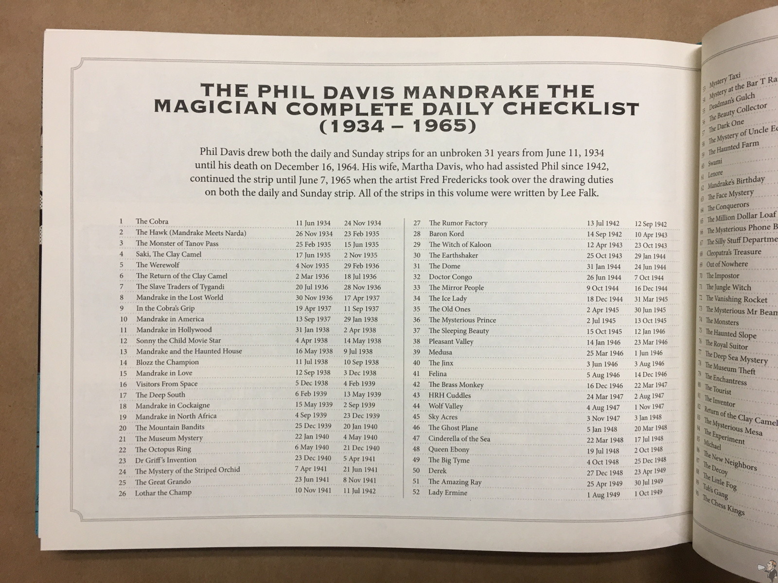
Two introductions are presented: a personal encounters note by Bob Griffin and a Mandrake essay by Rick Norwood. A table of contents lays out the stories, and every page features the story title at the top center and the page number at the bottom center. It closes out with a story checklist, presenting the thirty-one years of stories drawn by Phil Davis.
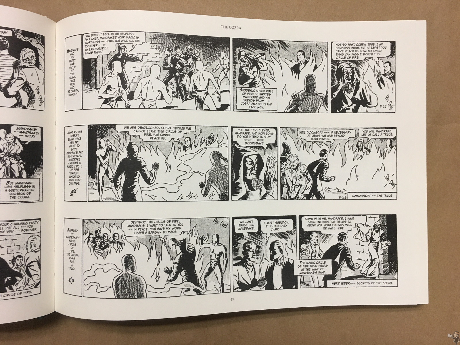
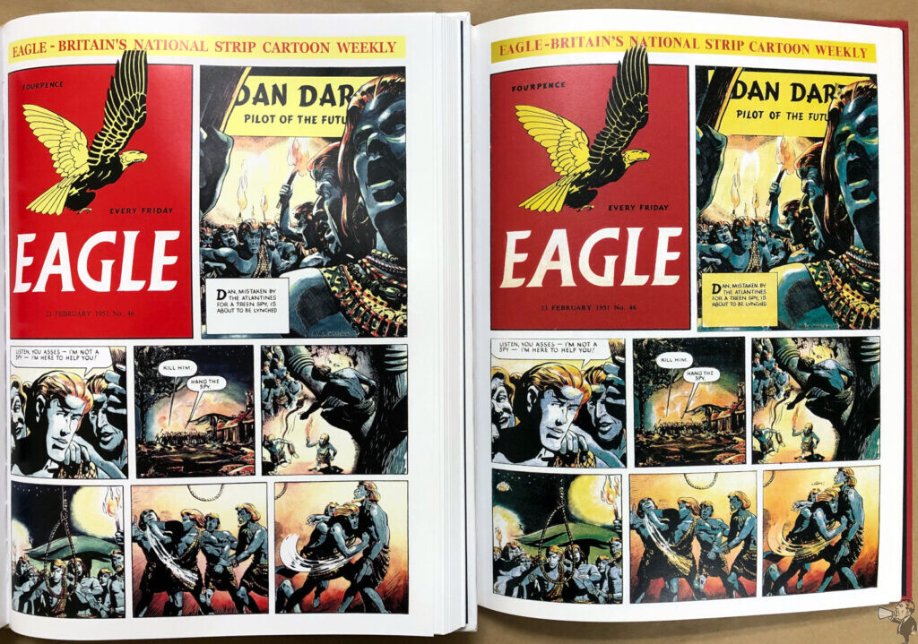
Reproduction quality is good. Davis’ style of clean lines works well with the limited abilities of the daily newsprint of its day, and it reproduces well. I do appreciate the note that ends the indices:
Much of the comic strip source material used by Titan Comics in this edition is exceedingly rare. As such, we hope that readers can appreciate the quality of reproduction achievable can vary.
Sadly the credits are thin, with no editor or reproduction named, just “Re-lettering by Jon Scrivens”. Scrivens’ work here is excellent, with clear and clean lettering throughout. I was able to find original strips online and compared them to what is presented here: it looks like the lettering evolved in the strip the first few weeks and then maintains its style. Scrivens looks to have gone for the later refined style and used that for all the books’ strips.
It’s a sewed binding and lays flat after a center crease smoothing. The paper is a thick but light stock, matte, that does have some bleed through. Overall excellent production.
Originally published at Comic Book Daily.

