It is the winter of 1937, and Aimé Louzeau lives with his mother and their servant. One day, he goes to the Quai des Orfèvres, the police prefecture of Paris, to speak with the vice squad. He currently works in the Criminal Investigation department, but crimes of passion and back alley stabbings really aren’t his thing, so he requests a transfer from Chief Inspector Séverin. The atmosphere immediately darkens, as Louzeau is thrown straight into the interrogation of a pimp called Guapito and his prostitute.
- Europe Comics, November 2016
- Script by Zidrou
- Art by Jordi Lafebre
- 62 pages
- 7.49€ Euro
- Order online: Izneo, Amazon
A stunning illustrated peek behind the curtains of pre-war Paris.
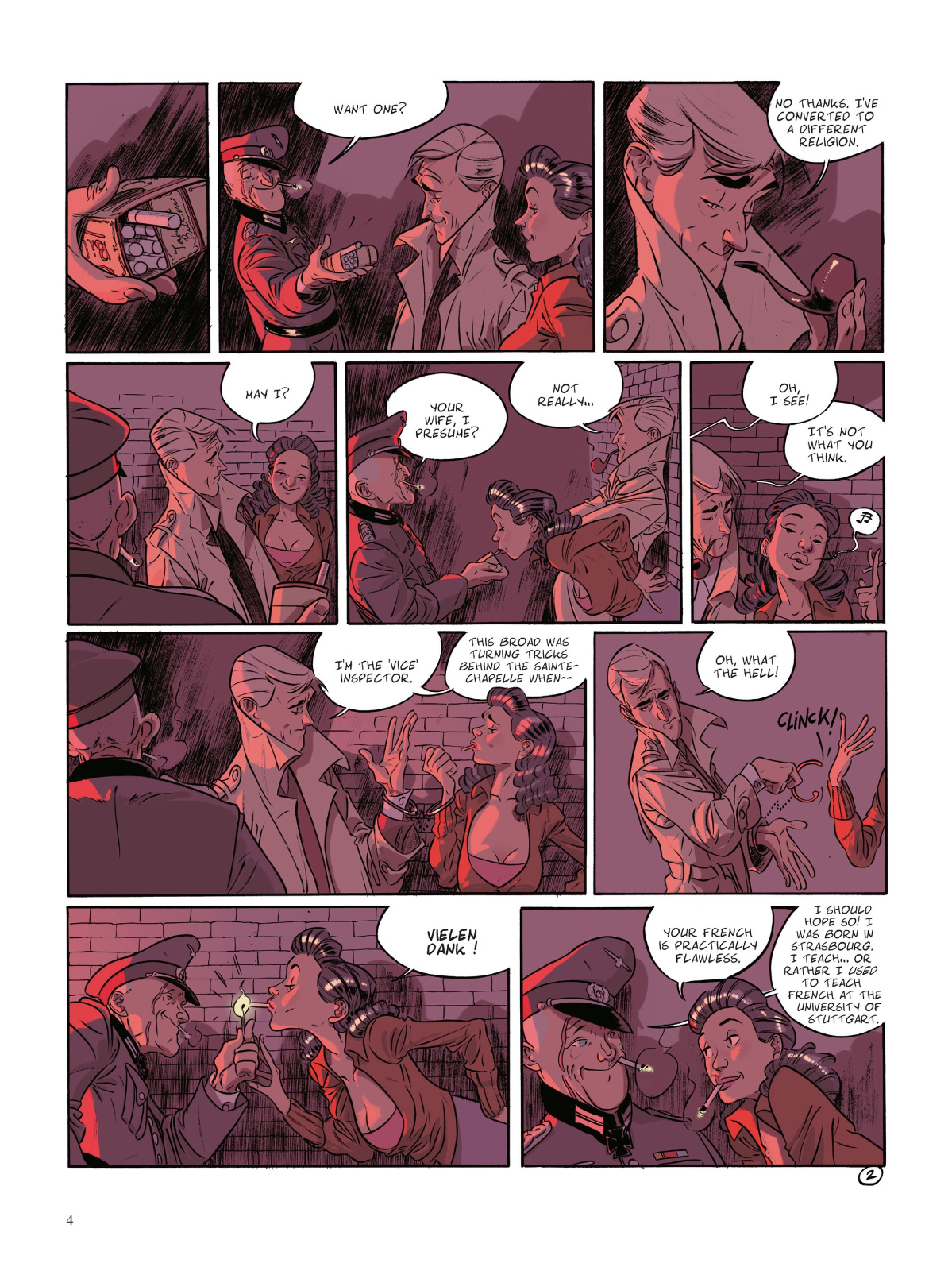
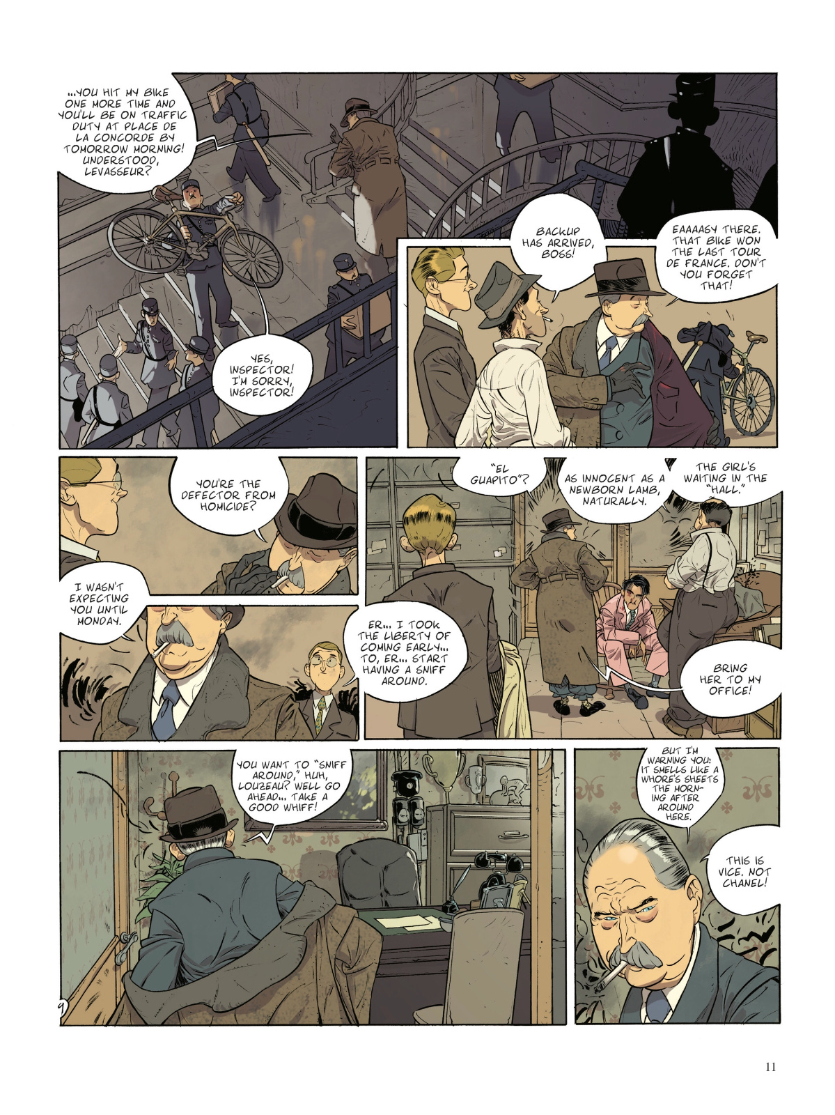
Zidrou is a prolific writer, and once again has crafted a unique and engaging tale. We’re introduced to a widely different ensemble during a night bombing of Paris, but only to frame the story as a remembrance and origin of our protagonist.
Aimé transfers from homicide to vice, entering a world of cops, customers and those who service them. Every character is deeply influenced by their work, the effect of the environment and subsequently how they deal with it.
It’s an interesting take as we watch Aimé begin to slide away from his character, or perhaps move towards his real character. It’s not often the protagonist is someone we grow to dislike, but it’s done elegantly and thoroughly, brick by brick, moment by moment.
There is a lot left for the reader to decide and interpret, but with an inevitable conclusion. A truly unforgettable style. The story is full of emotion as piece after piece of Aimé’s life is revealed and the layers are peeled away.
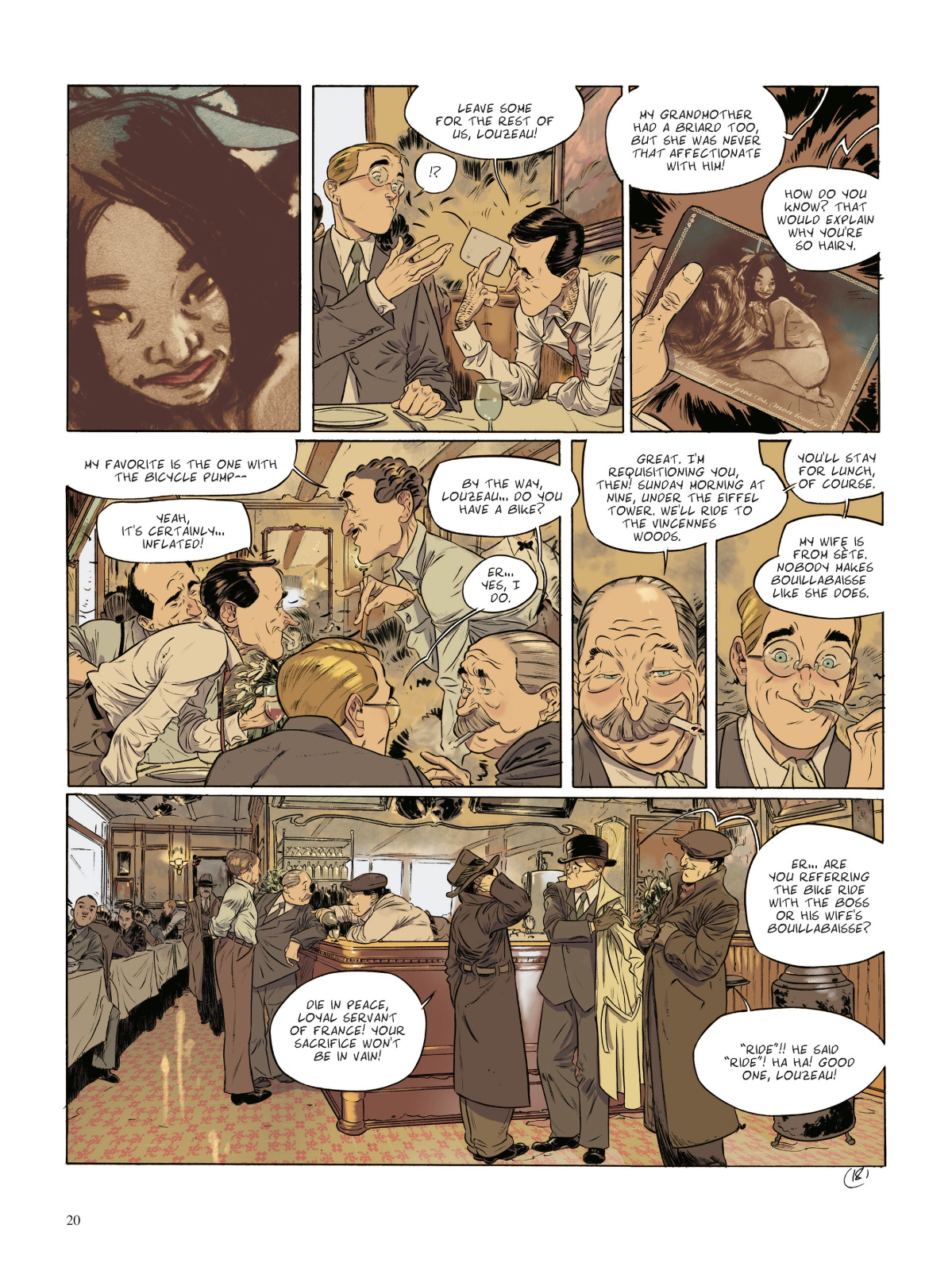
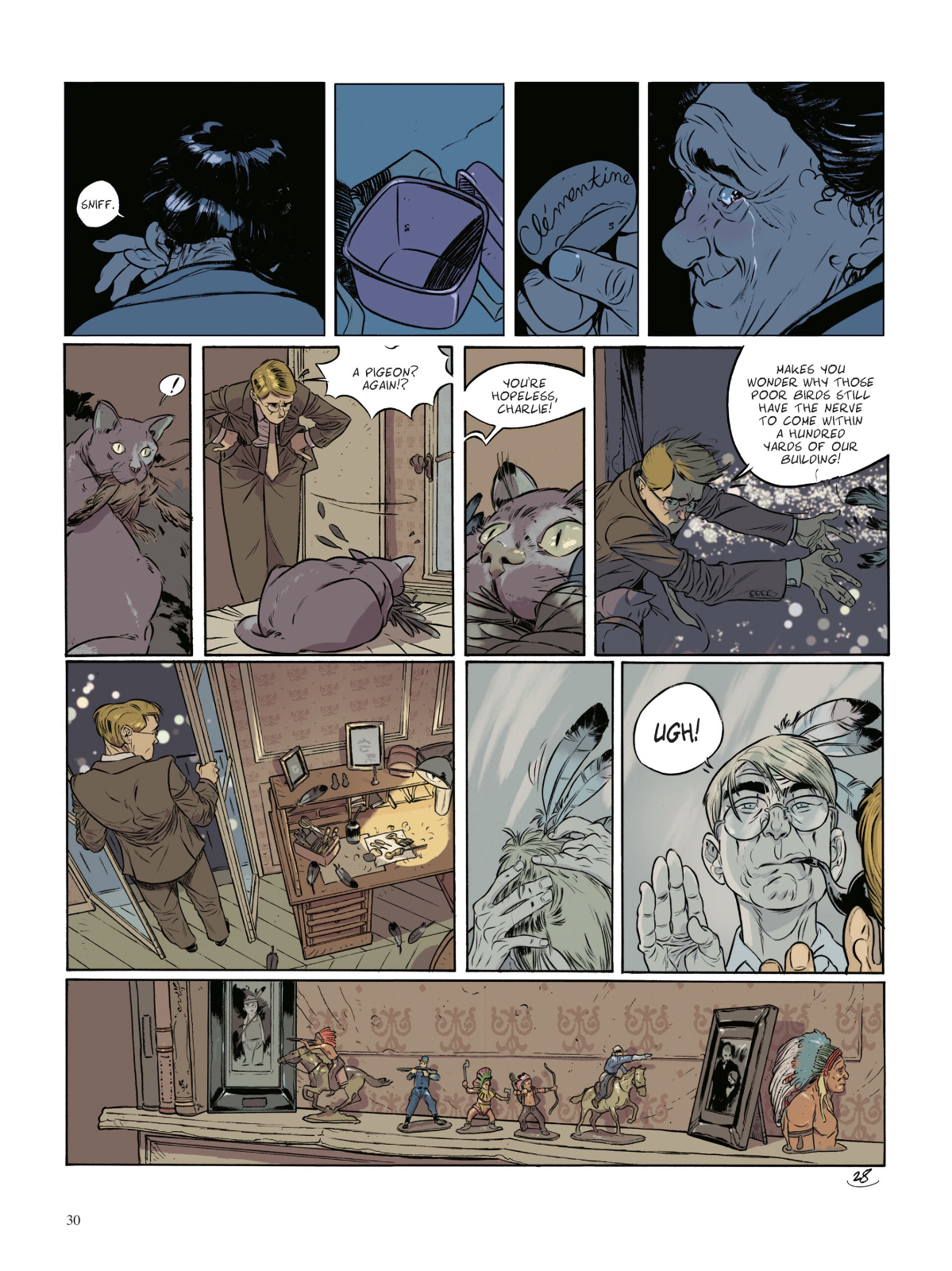
Lafebre’s art is stunning. Characters and environments beautifully defined and detailed. So much expressed through body movement and facial expressions. A real treat in this format of static images on a flat page. The work truly comes alive.
Panel layout and composition to pose the characters at varying distances, repeating images or moving them between panels for effect and the flow of a moment.
He’s colouring this work as well, and integrating texture and pattern to layer his pencils and inks. Lafebre’s made the colour a key part of the art process. Great stuff.
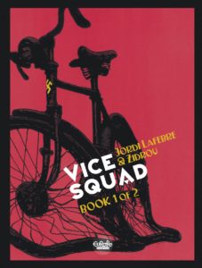
The relative simplicity of the cover only comes to full effect after you’ve completed the story. Poignant.
The lettering is clear and concise for the most part, or for the bulk of the story that happens in the past. The narrator has a cursive font that’s a bit difficult, but only appears sporadically.
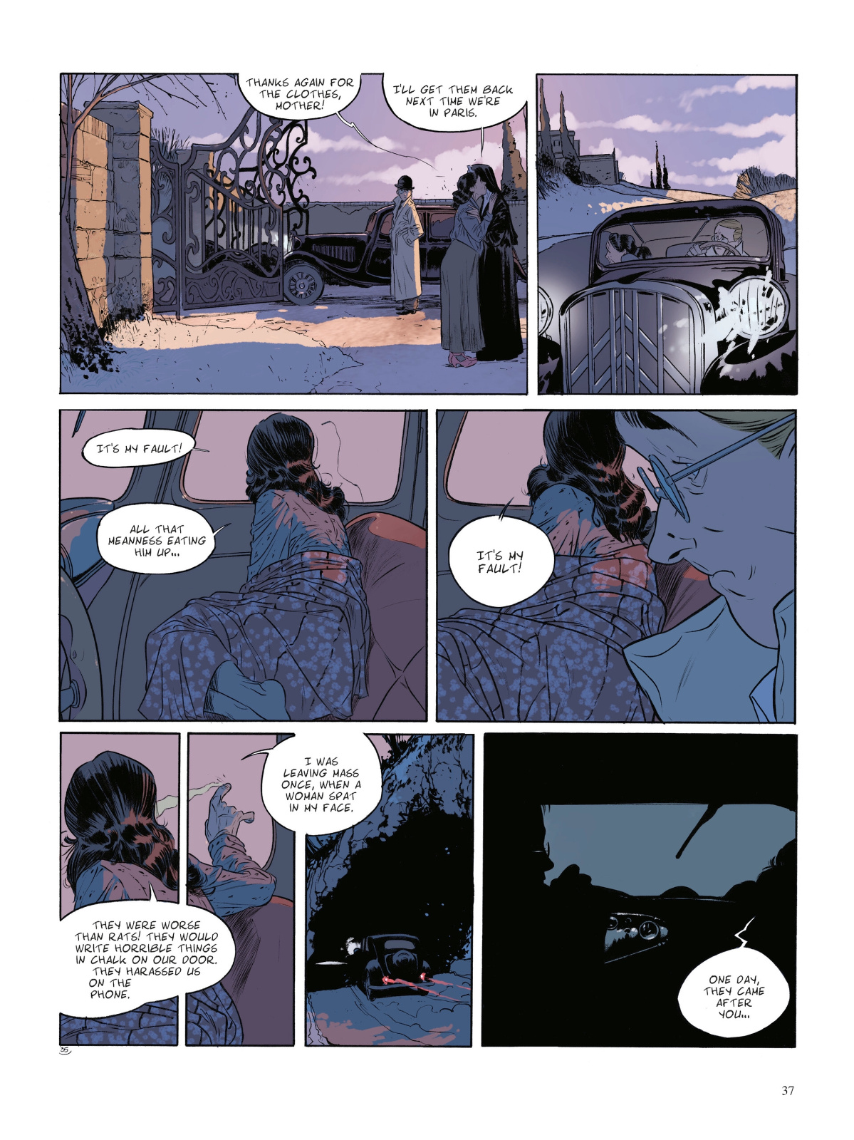
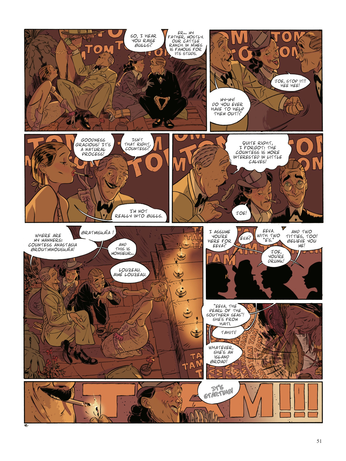
Please check out the preview below from Izneo, who provided my digital copy for review.
Originally appeared at Comic Book Daily.

