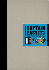
I gave Roy Crane’s Captain Easy, Soldier Of Fortune: The Complete Sunday Newspaper Strips Volume 1 1933-1935 a good thumbing many, many times before picking it up. The artwork was too simple, the stories silly. One day in my local comic shop with nothing new to read I picked it up.
The first of six volumes contains the earliest Sunday pages from 1933 to 1935. In his first adventure, Captain Easy visits a lost city, battles pirates, dons a deep-sea diving suit to explore a sunken ruin in search of treasure, and everywhere he goes, he finds beautiful women — a lost princess, a pirate queen, a savage woman in need of` “taming.” A romantic adventurer from a less politically correct age, Captain Easy is a Soldier of Fortune whose bravery and daring are exceeded only by his Southern gallantry.
Crane created the template for the adventure strip, combining adventure and humor in a Bigfoot cartooning style that perfectly conveyed the tongue-in-cheek tone and light-hearted thrills that kept readers on the edge of their seats. As comics historian Brian Walker put it, “the artist’s patented visual storytelling technique blended humor, drama, heroics, and pretty girls.” Crane’s Captain Easy influenced virtually every cartoonist who followed him — from Chester Gould (Dick Tracy) to Milton Caniff (Terry and the Pirates) — and even Hollywood’s adventure movies starring the likes of Cary Grant or Errol Flynn adopted Crane’s tone of two-fisted, good-natured derring-do. Citing Crane’s influence on comics, the artist Gil Kane once said, “Superman was Captain Easy; Batman was Captain Easy.”
- Author: Roy Crane
- Hardcover, 144 pages
- 10.5″ x 14.75″, full colour
- Fantagraphics, 2010
- ISBN-13: 978-1-60699-161-9
- $39.99 USD
- Order online: Amazon
What I failed to comprehend as I stood in the comic shop flipping pages in this book is that Crane chose the elements of his strip carefully, especially those I dismissed it for. Simple character design, bright colours, fictional locations and action with a sense of humour. After finishing the volume I applaud his choices.
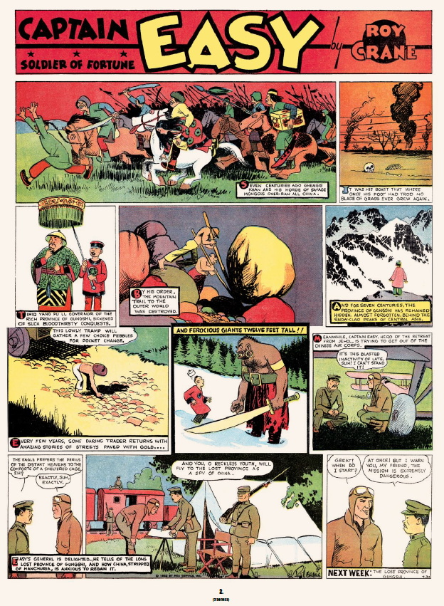
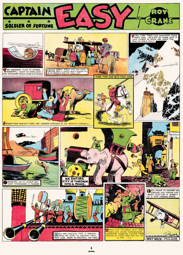
The story is beautifully set up in the first strip: Easy is an American with a southern drawl that’s working in the Chinese Air Corps. He’s a flyer that wants to see some action. That’s about it: Easy is off in his first adventure, Gungshi. That’s followed by four more chapters, each exploring different fictional locales filled with warring tribes, pirates, witch doctors, beautiful women and above all conflict and adventure. Along the way, he picks up a sidekick named Pippy that takes on that odd slapstick role so popular in the early 20th century.
Crane employs phonetic spelling to replicate accent and for the most part it works, from Easy’s drawl to Pippy’s Cockney twang and everything in between. Since the strip is about adventure in foreign lands accented dialogue comes into play on every page, but it’s the bright colours of the character’s costumes, locations and even panel backgrounds that give Captain Easy its energy.
Layout and structure are visually appealing and almost free form, with various sized boxes laid out across the page. Word balloons convey dialogue and story elements in squares. Simple and easy to follow. Since these colour strips appeared weekly we’re treated with a short recap to begin and a very brief preview for the coming week.
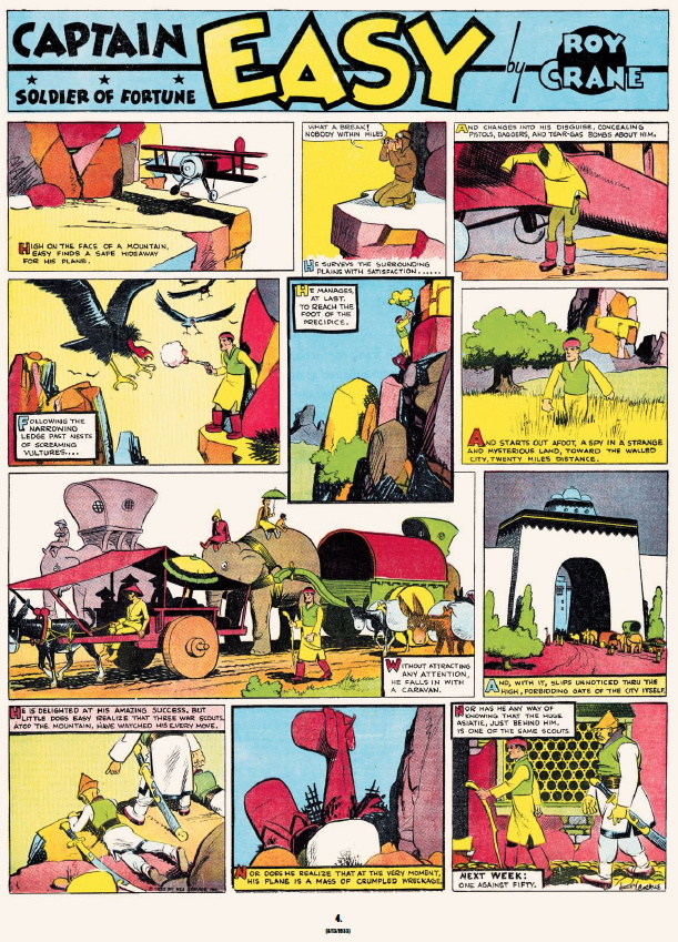
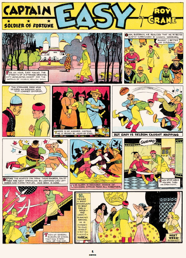
All foreign locations are exotic and play to the sensibilities of the early 20th century. Characters have exaggerated features, playing off a lot of stereotypes like Asians, tribesmen and even eastern Europeans. Take it with a grain of salt.
Courtesy of the Coloring Notes afterward by editor Rock Norwood we know this volume was produced from colour scans of Sunday pages printed in newspapers. Unfortunately, there’s no mention of work done on the individual scans but they appear to have the limited printing abilities inherent to their period. That’s not to say we’re treated to anything less than clear and legible reproductions.
Production of this 10.5″ x 14.75″ hardcover is wonderful: a very heavy paper between sturdy cardboard covers. The die-cut corners are a cause for concern since all the copies I’ve seen start to separate where pressure is placed, usually the bottom. There’s a lot of material here to justify the $39.99 USD cost.
Originally published at Comic Book Daily.

