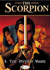
Some online perusing of Cinebook offerings convinced me to pick up a copy of The Scorpion Volume 1; this includes The Devil’s Mark and The Pope’s Secret, two previously published French works by Enrico Marini and Stephen Desberg. Cinebook publishes foreign language books in English, allowing us to appreciate some great works.
It seems a lot of French comics are published as 48 page issues and Cinebook likes to publish them in two issue volumes. As well first credit is given to the artist and second credit to the writer, a reversal of North American credits but one I appreciate since art is still my main draw to new titles. Here’s the publisher’s blurb:
Rome the beautiful is dying, the symbol of civilization falling, the empire burning. Hidden from massacres and looting, a strange meeting is held by nine families who share the Roman Empire. To retain their power, they decide to support a new religion—Christianity—as well as its representative, the pope. But who are these 9 mysterious families?
Later, much later, it’s the Renaissance. Christianity prospers. A brigand called “the Scorpion” makes a living by unearthing relics in the depths of the Roman catacombs, which he sells at high prices to princes and bishops. Trebaldi, a powerful cardinal, takes an interest in this Scorpion, who is either a creature of the devil… or a witness to a cursed era who must disappear…
How can you not be hooked with a lead up like that? The Scorpion is a swashbuckling story set against Renaissance Italy, filled with historical intrigue. I’m a sucker for historical fiction, especially when it draws upon the awesome background of the Catholic church.
Character and story development are rich and detailed; no question the reader is drawn into this world and is fully immersed. For some reason the hero has an overweight and slightly bumbling assistant as comic foil but here it works. The Scorpion is all the best elements of the swash buckler: I can easily see Errol Flynn in this role. Detailed, witty, funny, serious: well written.
Of course it’s the art that hooked me and had me staying. The style is crisp and clean; highly enjoyable. I couldn’t locate any other credits so I’m guessing Marini does the inking and colouring as well. The colours, backgrounds and overall artistic style make a beautiful frame for the story.
My only issue is the font and text style used for the word balloons; it doesn’t seem to fit the book. As well there’s this disclaimer:
With the author’s consent, and in order not to upset our more sensitive readers, certain illustrations of this edition of The Scorpion have been modified.
What does that even mean? I’d like to see some before and after panels to form an opinion. But that’s a small blemish on an otherwise remarkable work.

