Panel layout is one of those features, or more accurately functions, of a comic that goes completely unnoticed unless it breaks out of the established boundaries. The other function that slips by is lettering but that’s a topic for another day.
Before plunging any further the question should be asked if panel layout should receive attention or recognition. As readers, we’re focused on the story that appears within the panels: dialogue and art. The panel provides the boundary of that moment, and the story is made up of however panels are required to tell it. It should in no way interfere with the telling of the story, but without it what would we have? Integral yet mostly invisible, until it’s not.
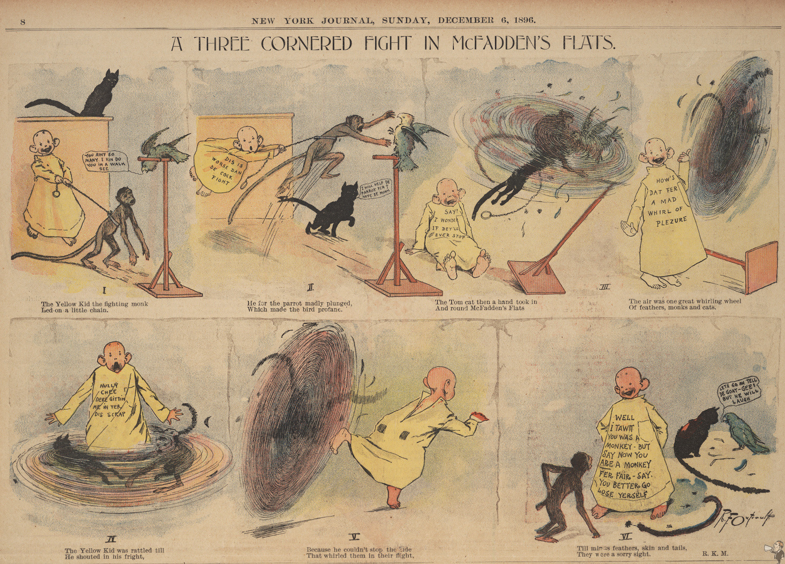
Looking at the history of comics and the comic strip most roads lead to The Yellow Kid. While mostly employing a full-page illustration with spot text Richard Outcault begins using a frame by frame panelling sequence in 1896; note the panels are numbered so the reader can follow the sequence in the proper order.

From that point, we have the panel grid page, with the same basic layout today. Panels may shrink or grow on the page to tell the story of that moment but we’re still following this for good reason: it works. Looking at Buck Rogers, Flash Gordon and Prince Valiant all show adherence to this basic formula. In those days if panels were different sizes the artist would include directional arrows so the reader would know the reading sequence.
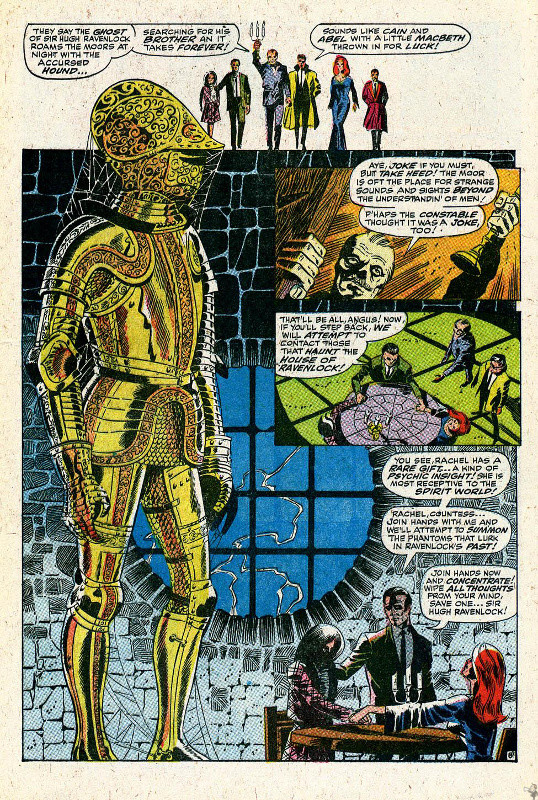
When an artist with an eye for design comes along they use the page layout as an element of the story. Jim Steranko and his page size figures along the panels are one of the most striking examples. By the 1960s everyone knew how to read a comic page: either left to right or top to bottom. Steranko gives us full-on visuals, using the background as a panel break, layering of panels onto the main image and overall tearing down the established rules.

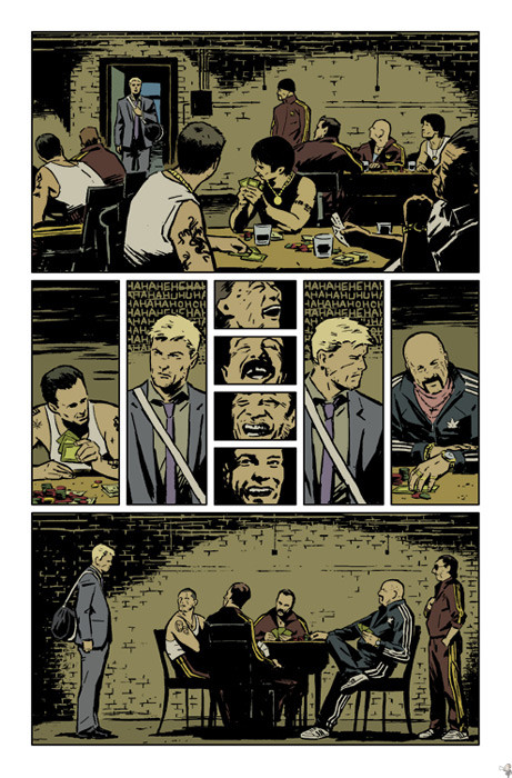
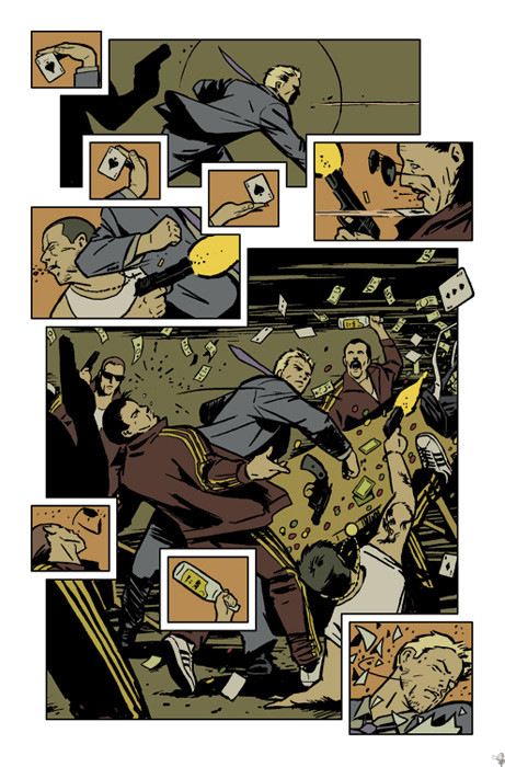
The reason for this column came from a five-page preview of Hawkeye, illustrated by David Aja. Here are two pages from that preview that fully utilize the panel.


Aja’s keeping the panel block shape with gutter (empty space border) but employing at different sizes to present the story in a compelling manner. The four laughing faces in the first page tell so much in so little space, as do the action panels of the second page. They’re frenetic and give so much, tied together with the same background colour.
While perfunctory in most comics the humble panel can achieve a starring role in telling the story when used effectively.
Originally published at Comic Book Daily.
